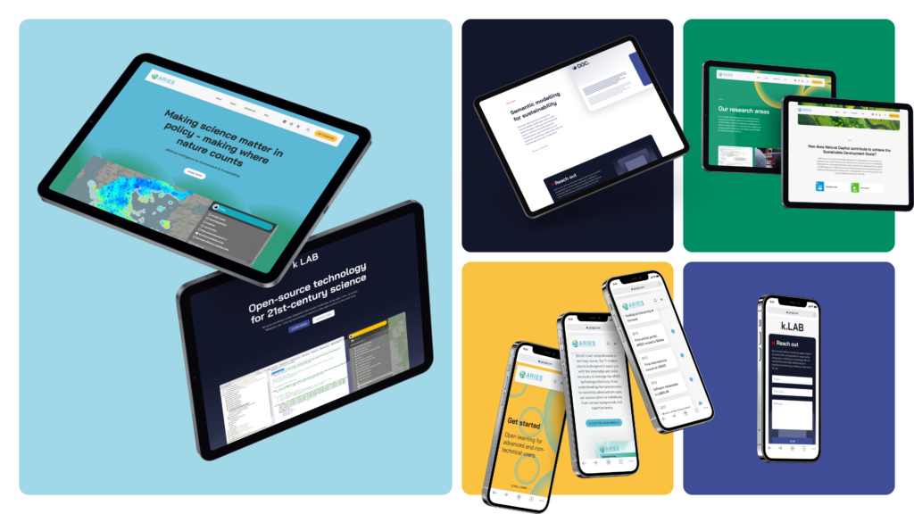
Today we’re launching k.LAB’s new logo, following the ARIES fresh look. With this update, we expect the k.LAB brand to be more consistent and more instantly recognizable.
This update happens along with the redesign of the logo of the Integrated Modelling Partnership, the network that develops and maintains the k.LAB software, and supports partners and users in creating unprecedented model-data integration in projects like ARIES.
Both logos were based on a common icon, which gave them a sense of cohesion: a black elephant on a white, circular and borderless background, playing with a red ball.
Elephants have a great and positive symbolic meaning in many different cultures for being the removers of obstacles, as well as the god of luck, protection and fortune. The red ball at the top of the elephant’s trunk, instead, represents the wisdom and intelligence.
In order to simplify while reinforcing the cohesive visual identity between the two logos, both typographies fonts and colours have been unified. We have also removed the elephant symbol from the k.LAB logo, and replaced it with the red ball as the main common element.
This last change in particular helps both users and partners establish the visual hierarchy between the new paradigm that the Integrated Modelling Partnership offers and the technology that makes it real, represented by k.LAB.
According to Ferdinando Villa, k.LAB and Integrated Modelling Partnership founder, and ARIES lead investigator, “this change is not only visual but also conceptual, as knowledge integration is at the core of the principles of the Integrated Modelling Partnership and now it is also highlighted in k.LAB.”
Over the next few weeks, the Integrated Modelling Partnership website and k.LAB software will be updated with the new logos, respectively.
